Color is one of the most powerful design tools you can use in your home. Beyond aesthetics, it influences mood, energy, and even behavior.
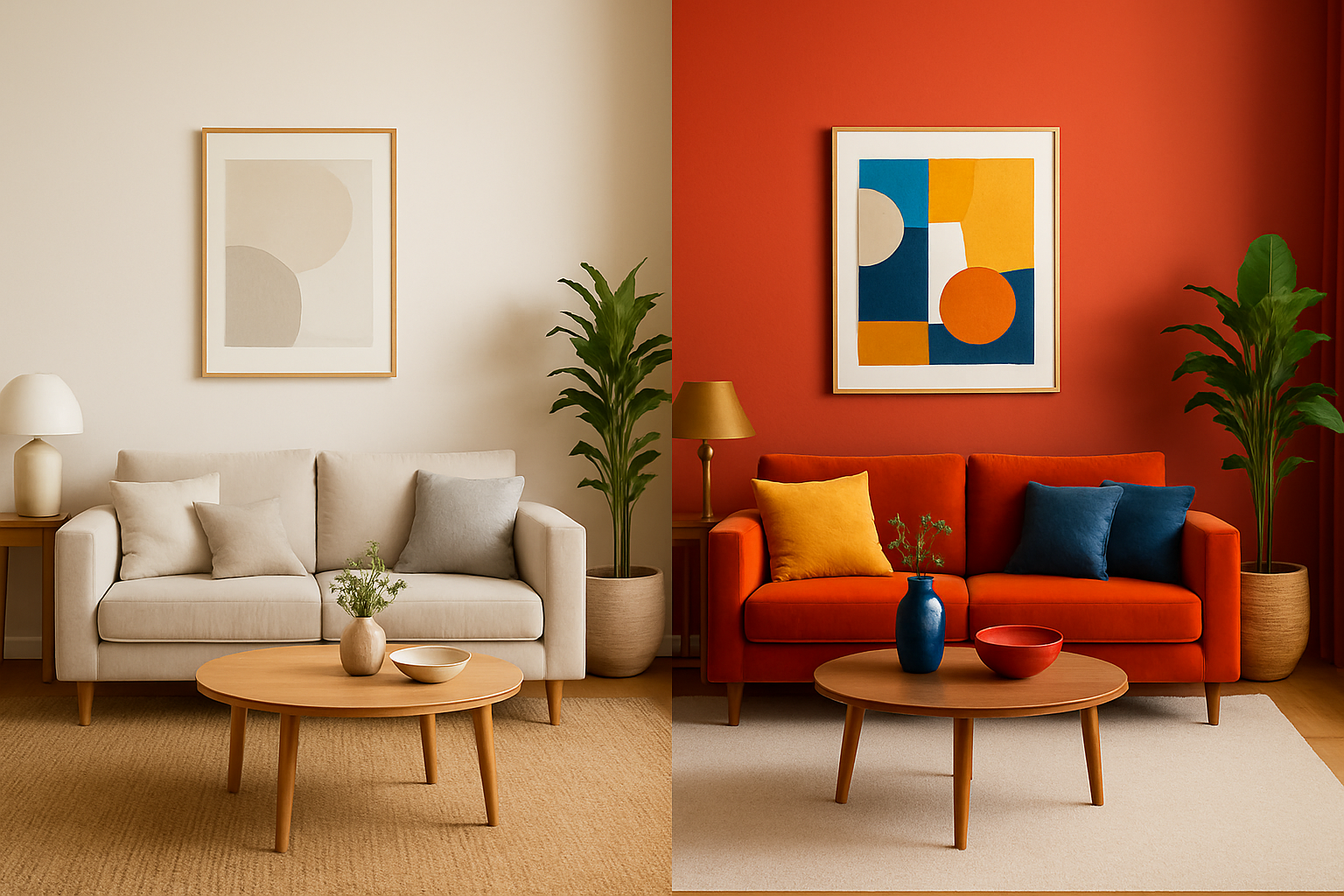
Choosing between a neutral palette or vibrant tones is one of the most common dilemmas homeowners face. Neutrals bring timeless calm and adaptability, while bold colors infuse personality and energy.
The decision doesn’t have to be overwhelming. By understanding how colors affect emotions, what each approach offers, and how to balance them, you can craft a home that feels aligned with your style and lifestyle. Let’s explore both sides and see which one speaks most to you.
The Psychology of Color
Colors aren’t just decorative—they’re psychological triggers. They can relax or stimulate, focus or distract. Recognizing these effects helps you design rooms that feel intentional.
Warm colors like red, orange, and yellow often feel energizing and social, making them great for kitchens or dining rooms. Cool colors such as blue, green, and purple are calming, making them ideal for bedrooms and bathrooms.
Neutrals—including white, beige, and gray—provide stability, offering a backdrop that doesn’t compete with other elements. Meanwhile, vibrant hues like emerald green, hot pink, or cobalt blue are stimulating and full of personality.
Understanding this emotional language allows you to choose not only what looks appealing but also what feels right for your day-to-day life.
The Allure of Neutral Colors
Neutral tones are a cornerstone of both classic and contemporary interiors. They bring a sense of serenity and open possibilities for layering. Simplicity and versatility are their strongest traits.
A major advantage is timelessness—neutrals rarely go out of style, so your home will look fresh for years. They also enhance natural light, especially lighter shades like cream or ivory, making spaces brighter and more open. Finally, they encourage calm, which is why many people use them in bedrooms or relaxation areas.
However, overuse can lead to blandness. Without contrast, neutral-heavy interiors risk feeling flat or uninspired. They also demand maintenance, especially lighter shades that show wear quickly. Balance is key to ensuring they remain elegant rather than dull.
The Impact of Vibrant Colors
Vibrant colors are expressive and bold, instantly creating visual impact. They define personality in ways neutrals often cannot. Energy and identity are at the heart of using vivid shades.
Bright tones can set the mood—yellow uplifts, red energizes, green balances, and blue soothes depending on intensity. They’re also excellent for creating focal points. A colorful sofa, statement wall, or vivid piece of art instantly draws attention and anchors the design.
Still, vibrancy must be managed carefully. Too much can overwhelm the senses or make a space feel chaotic. Trends also shift quickly in bold palettes, which means what feels stylish today may feel dated tomorrow. Used wisely, however, vibrant colors turn ordinary rooms into unforgettable spaces.
Choosing Colors by Room Function
The right palette often depends on the purpose of the room. Consider how each space is used daily and the emotions you want it to evoke.
- Living Room: Neutral palettes make for flexible, welcoming spaces, while vibrant accents through rugs or artwork add personality without overwhelming.
- Bedroom: Soft neutrals promote sleep and relaxation, but jewel-toned accents on bedding or walls can add richness.
- Kitchen: White and gray kitchens are timeless and easy to maintain, but colorful cabinets or backsplashes energize the space.
- Bathroom: Neutrals create a spa-like effect, while bold towels or tiles inject playfulness.
- Home Office: Neutrals aid concentration, but splashes of color can inspire creativity.
By aligning the palette with function, you’ll create spaces that not only look good but also support your lifestyle.
Mixing Neutrals and Vibrants
You don’t have to pick one camp exclusively. Some of the most successful interiors combine both, creating balance and interest. Contrast and layering are the secret ingredients here.
Start with a neutral foundation—walls, large furniture, or floors. This establishes a calm base. Then, introduce bold tones through accents like pillows, curtains, or artwork.
Following the 60-30-10 rule helps maintain balance: 60% dominant color (often neutral), 30% secondary color, and 10% accent in a bold hue.
Texture is also essential. Mixing linen, velvet, wood, or glass prevents neutral schemes from looking flat, while in colorful rooms, simpler textures can prevent visual overload.
Letting Your Style Guide You
Ultimately, the choice between neutral and vibrant colors should reflect your personality. Think about how you dress, what colors you naturally gravitate toward, and how you want your home to feel day to day.
Ask yourself a few questions:
- Do I feel more at ease in calming environments or energized in lively ones?
- Am I looking for long-term stability or do I enjoy experimenting with trends?
- Do I prefer making bold design statements or creating quiet elegance?
Your answers will reveal where you sit on the spectrum. For some, neutrals offer peace and flexibility. For others, bold hues bring joy and creativity. And for many, the sweet spot lies in layering both.
Final Thoughts: Color as a Personal Journey
There is no single “right” answer to whether neutral or vibrant colors are better. Color is deeply personal—it reflects who you are and how you want to live. Neutrals give you timeless elegance and a flexible foundation, while vibrant colors inject excitement and individuality.
The beauty lies in blending them to suit your space. Start neutral if you crave calm, layer in vibrancy if you need energy, or strike a balance that feels authentic. What matters most is how your home makes you feel. When your surroundings echo your style and support your well-being, that’s when color truly succeeds.