Shades of blue have always held a special place in interior design because of their timeless appeal and wide versatility. From the gentle softness of powder blue to the richness of navy and indigo, blue offers emotional depth and style flexibility that few colors can match.
It can make a space feel fresh and calming, or dramatic and elegant, depending on how it’s used. Incorporating blue successfully into your home décor isn’t simply about choosing a single tone—it’s about layering shades, balancing accents, and matching the right textures to the mood you want to create.
Blue also adapts beautifully to different home styles, whether you prefer coastal lightness, modern sophistication, rustic comfort, or eclectic vibrancy. This makes it a reliable color choice that can evolve with your personal style over time.
When used thoughtfully, blue creates an atmosphere that feels both refreshing and deeply grounding. The trick lies in knowing which shade suits each room and how to combine it with other design elements.
Because blue is so versatile, it works well in everything from wall paint to furniture, textiles, and accessories. The range of moods it can evoke—from serene to luxurious—makes it one of the most effective colors for interior design. Understanding how to use blue across different rooms and styles will help you unlock its full potential in your own home.
Understanding the Psychology of Blue
Colors influence emotions in powerful ways, and blue is one of the most universally calming tones. It evokes feelings of serenity, trust, and clarity, which explains why it’s often chosen for spaces designed for relaxation and reflection. Bedrooms, bathrooms, and living areas, in particular, benefit from its soothing nature.
Lighter shades of blue tend to feel airy and expansive, making them ideal for smaller rooms or spaces that need a sense of openness. Mid-tone blues strike a balance between calm and energy, offering versatility that works in both living rooms and kitchens. Deep navy and indigo carry richness and drama, giving interiors an elegant and grounding quality.
When selecting a shade of blue, it’s essential to think about the mood you want to create. A bedroom with powder blue walls will feel tranquil and light, while a study with navy accents will feel sophisticated and focused. Blue is not a one-size-fits-all color—it’s a palette of emotions waiting to be tailored to your home.
Choosing the Right Blue for Each Room
Each room in your home has its own character and purpose, which means certain shades of blue will work better in specific spaces. By paying attention to light levels, room size, and function, you can make blue enhance rather than overpower your design.
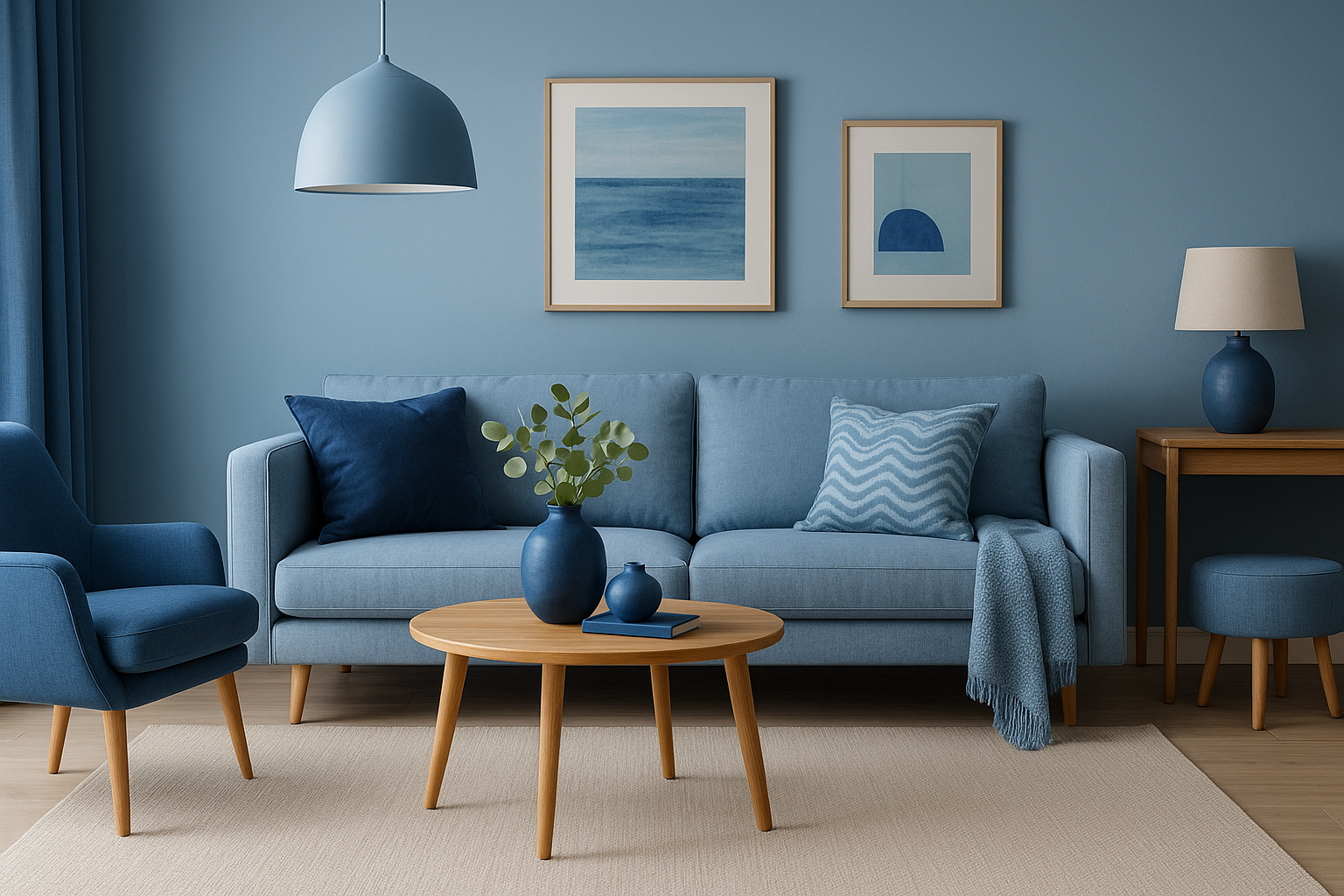
In the living room, soft blues create a relaxed, open atmosphere, while navy accents add depth without overwhelming. Pairing blue with beige or cream keeps the palette warm and welcoming.
Bedrooms benefit from lighter tones like sky blue, which encourage rest, though deeper shades used sparingly can create a cocooning effect. Kitchens and dining areas respond well to teal or turquoise, which add vibrancy, while navy cabinetry paired with brass hardware feels both modern and luxurious.
Bathrooms are another perfect canvas for blue. Aqua and seafoam bring a spa-like freshness, while cobalt or navy make smaller spaces feel bold and dramatic. To keep the look clean, pair these deeper shades with crisp white fixtures. By tailoring the shade of blue to the room’s purpose, you create spaces that feel harmonious and intentional.
Pairing Blue with Other Colors
One of blue’s greatest strengths is how easily it pairs with other colors. Depending on your palette, it can feel crisp, cozy, luxurious, or playful. Classic blue-and-white combinations instantly recall coastal or traditional designs, while blue and gold create elegance and warmth. For a sleek, modern atmosphere, blue pairs beautifully with gray.
If you want a natural, calming palette, try blending blue with green tones, particularly in spaces inspired by nature. A playful, eclectic effect can be achieved by pairing blue with pink, which softens the coolness and adds charm. The key is balance: blue is a cool color, so pairing it with warm tones like beige, terracotta, or metallics prevents the room from feeling too cold.
Some popular pairings include:
- Blue and white for freshness and tradition
- Blue and gold for luxury
- Blue and gray for a modern edge
- Blue and green for nature-inspired calm
These combinations prove just how flexible blue can be, fitting into nearly every design style.
Using Blue as an Accent
If you’re not ready to commit to painting walls or investing in blue furniture, you can still enjoy the benefits of this color through accents. Small touches of blue can transform the feel of a room without overwhelming it, giving you the freedom to experiment.
Throw pillows, blankets, or rugs featuring blue patterns are an easy starting point. Artwork with oceanic tones or abstract blue compositions also introduces personality. Decorative pieces like vases, tableware, or lamps in cobalt or turquoise add moments of vibrancy to neutral spaces. These accents can be switched seasonally, making blue a flexible choice for evolving interiors.
Accent pieces also give you the chance to explore multiple shades of blue together. A navy cushion paired with a powder blue throw creates a layered look that feels sophisticated yet approachable. Accents are a low-commitment way to bring blue into your design, while still making a significant visual impact.
Layering Shades of Blue
One of the most refined ways to incorporate blue is by layering multiple shades. Instead of limiting yourself to a single tone, combining light, medium, and dark blues adds depth and richness. This approach works particularly well in monochromatic interiors, where different shades of the same color create harmony and visual interest.
You might start with light blue walls as a foundation, then bring in navy furniture and mid-tone blue textiles. Patterns that mix several blue hues, such as rugs or curtains, help tie the palette together. By playing with depth and variation, you avoid a flat, one-dimensional look.
This layering technique also allows you to emphasize mood. Lighter shades keep the atmosphere open, while darker accents add sophistication. When balanced well, layered blues feel cohesive, stylish, and timeless.
Patterns and Textures in Blue
Patterns and textures are crucial for ensuring that blue-heavy spaces don’t become monotonous. Blue stripes immediately suggest a nautical aesthetic, while floral or botanical prints bring romance. Geometric patterns in shades of blue add a modern, dynamic edge.
Texture adds another dimension. Deep blue velvet creates luxury and drama, while light linen offers casual charm. Woven fabrics in indigo or denim tones bring an artisanal, global flair. The combination of smooth and rough, soft and structured, makes blue come alive in interiors.
Mixing patterns and textures doesn’t just make the design more engaging—it also gives the color itself more character. The tactile variety ensures that blue feels vibrant and inviting rather than flat.
Blue in Different Design Styles
The adaptability of blue means it works across virtually every design style. In coastal interiors, pale blues paired with sandy beige and crisp whites evoke the sea. Modern spaces often use navy walls, gray furniture, and metallic accents for a sleek look. Rustic kitchens shine with deep blue cabinetry and natural wood, while bohemian interiors embrace turquoise, teal, and indigo through textiles and wall art.
Traditional design also makes excellent use of blue, particularly through blue-and-white porcelain, patterned wallpaper, or timeless furniture silhouettes. Each style highlights different qualities of blue, from its calming nature to its bold richness.
The versatility of blue makes it a reliable design choice, whether you’re aiming for elegance, comfort, or eclectic vibrancy.
Balancing Blue with Warmth
Because blue leans cool, it’s important to balance it with warmer tones to avoid a chilly atmosphere. Natural wood, brass hardware, and soft, warm lighting all help bring warmth into blue-centered spaces. Textiles in earthy shades like rust, mustard, or terracotta can also create balance, complementing blue while softening its edge.
Lighting plays a particularly important role. Natural daylight enhances the freshness of lighter blues, while warm-toned bulbs make darker shades feel cozy rather than stark. It’s always a good idea to test paint samples at different times of day, since blue can shift dramatically depending on the light source.
When balanced properly, blue creates interiors that feel both fresh and inviting.
Final Thoughts on Using Shades of Blue
Blue is one of the most powerful tools in interior design because of its ability to adapt to any room, mood, or style. It can be soft and serene, bold and dramatic, or polished and timeless. By carefully choosing shades that match the purpose of each room, layering tones, and balancing blue with warmth, you can create interiors that are not only beautiful but also emotionally resonant.
Whether you bring it in through accent pieces, textured textiles, or full walls of color, blue always manages to feel both stylish and enduring. It’s a color that evolves with you, working equally well in casual or formal spaces, small rooms or large ones. Ultimately, shades of blue offer endless possibilities for creating interiors that are elegant, inviting, and timelessly appealing.