Mixing patterns in home décor can instantly bring life, personality, and depth to a room. When done well, it creates a layered, curated feel that captures attention without overwhelming the eye.
But when patterns are thrown together without balance, the result can be chaotic. The key is finding harmony between colors, scales, and textures so that patterns complement one another rather than compete.
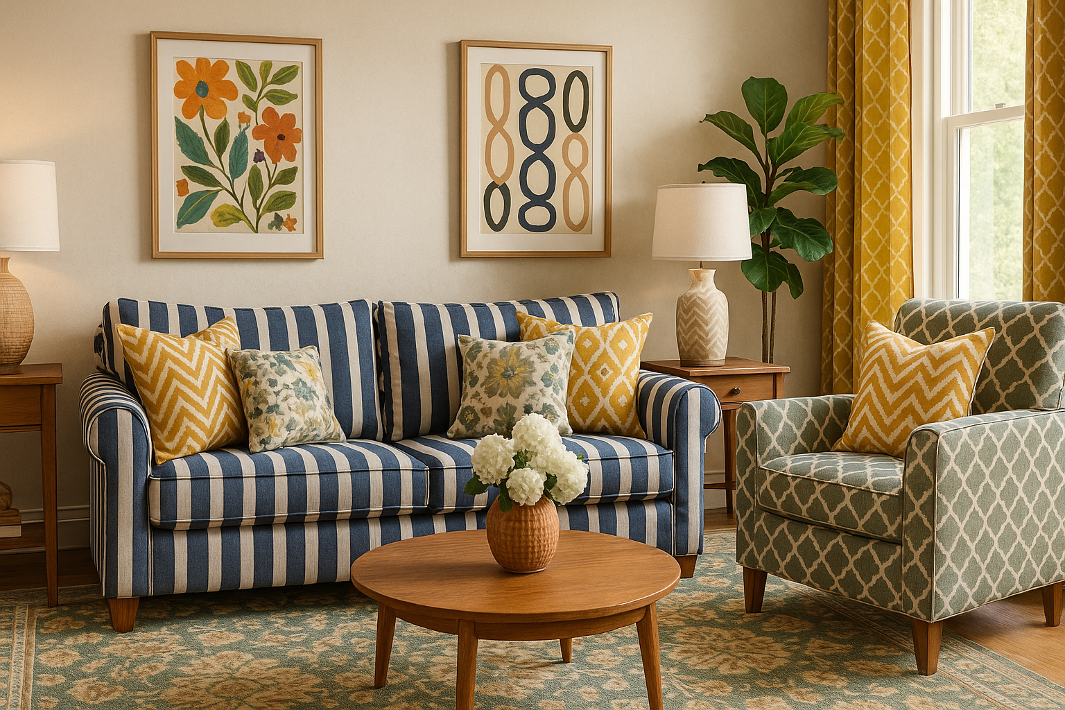
If you’ve ever admired a room where stripes, florals, and geometric prints coexist beautifully, you’ve seen the art of pattern mixing in action.
It’s not about following strict rules but about applying a few thoughtful principles. With the right approach, you can bring this look into your home and make it feel both stylish and cohesive.
Why Mixing Patterns Works
Patterns add a sense of rhythm and movement that plain surfaces often lack. They can turn a flat, neutral room into a lively, textured space without requiring new furniture or major renovations. By layering patterns, you introduce contrast, depth, and personality, which keeps the eye engaged.
Another reason patterns work so well is their ability to highlight focal points. A bold rug under the coffee table, a set of patterned cushions, or an accent wall can guide attention where you want it most.
Patterns also provide a way to express individuality—whether through bold geometric prints, delicate florals, or eclectic global designs.
Perhaps most importantly, pattern mixing prevents monotony. In a minimalist or neutral space, even subtle patterns add dimension.
When blended thoughtfully, they energize a room without making it feel busy. The challenge is knowing how to balance them so that they feel intentional and inviting.
Choose a Unifying Color Palette
Color is the glue that holds multiple patterns together. Without a consistent palette, the space risks looking mismatched. Sticking to two or three dominant colors, along with a neutral base, ensures that all the patterns feel connected.
A simple example would be a living room built around navy blue. A striped navy rug, floral cushions with navy accents, and a geometric throw blanket in the same tone instantly feel cohesive. Even if the patterns differ, the shared color unifies the design.
The neutral base is just as important. Shades of white, beige, or gray allow bold patterns to shine while maintaining visual balance. Think of neutrals as the resting points for the eyes—they give the patterns space to breathe.
Vary the Scale of Patterns
One of the most common mistakes when mixing patterns is using prints of the same size. This creates visual noise, making everything compete for attention. To avoid this, mix large, medium, and small-scale patterns.
Imagine a room with oversized floral curtains, a medium-scale striped rug, and a small dotted cushion. Each pattern has its role: the floral becomes the star, the stripes support it, and the dots add a playful finishing touch. The difference in scale prevents monotony while maintaining balance.
In small spaces, avoid using too many large-scale patterns, as they can overwhelm. Instead, let one statement piece carry the weight and support it with subtler designs. In larger rooms, bold, oversized patterns can anchor the space and create drama.
Limit the Number of Patterns
It’s tempting to use multiple prints, but restraint is key. A good starting point is no more than three patterns per room. This ensures variety without creating visual chaos.
You can think of it like a formula: one dominant pattern, one secondary, and one accent. For example:
- A bold patterned rug as the dominant piece
- Medium-scale patterned curtains as the secondary design
- Small patterned cushions as accents
This layered approach feels intentional and polished. Once you’re comfortable, you can experiment with more patterns, but for beginners, three is the sweet spot.
Mix Different Pattern Types
Patterns fall into categories such as geometric, organic, tribal, or textural. Combining different types creates visual interest and prevents repetition.
A room filled only with stripes, for instance, might feel flat, but add florals or ethnic prints, and suddenly the space feels dynamic.
Pairing opposites often works best. A structured geometric print can balance the softness of florals, while a tribal-inspired textile brings warmth to otherwise modern stripes. Mixing categories allows each pattern to shine without competing too heavily.
Textures also play a role here. Woven rugs, embroidered cushions, or quilted throws add subtle patterns of their own. By blending tactile surfaces with visual prints, you enhance the richness of the room.
Use Neutrals and Solids as Buffers
When patterns start to feel overwhelming, solids and neutrals act as anchors. They separate the busy elements, letting each pattern stand out rather than blur together. For instance, placing a plain sofa between patterned curtains and a bold rug creates breathing space.
Solid-colored throws, cushions, or rugs can instantly calm a pattern-heavy arrangement. Natural materials like wood, linen, and rattan also provide grounding textures that balance the vibrancy of prints. The key is contrast—the quiet of the neutrals makes the patterns more powerful.
Anchor the Room with One Focal Pattern
Every successful pattern mix needs a clear star. Choose one bold pattern to act as the focal point, then layer in others that echo its colors or motifs. This keeps the design from feeling scattered.
For example, a large patterned rug can anchor a living room, with supporting cushions and curtains pulling colors from its design.
Alternatively, a statement wallpaper can define a bedroom, with smaller patterns appearing in bedding or lampshades. By establishing hierarchy, you create order in what could otherwise feel chaotic.
Repeat Patterns in Small Ways
Repetition ties everything together. A stripe on a cushion repeated in a throw blanket, or a floral motif echoed in wall art, creates a sense of flow. These echoes don’t need to be exact matches—just similar enough to feel intentional.
Repeating patterns subtly across rooms also creates continuity throughout your home. A geometric print in the living room might reappear in the hallway as part of a runner or light fixture. This layered repetition ensures the look feels connected rather than random.
Final Thoughts: Mastering the Balance
Mixing patterns in décor is as much about intuition as it is about rules. By sticking to a unifying color palette, varying scale, limiting the number of patterns, and using neutrals as buffers, you can achieve a look that feels lively but not overwhelming.
The secret is balance: every bold pattern needs a softer companion, every busy corner needs a calm anchor. Start small with cushions or rugs if you’re hesitant, then build confidence as you experiment. Over time, you’ll learn how to combine patterns that reflect your personality while keeping your home harmonious.
With practice, you’ll master the art of mixing prints so that your décor feels intentional, curated, and uniquely yours.