Color is one of the most powerful tools in interior design, capable of transforming the mood, style, and energy of a space.
The right color choices can make a room feel larger, cozier, or more vibrant, while the wrong ones can create imbalance or discomfort. When decorating your home, selecting the right palette for each room ensures harmony, comfort, and functionality.
Every shade evokes emotions, which is why designers often say that choosing colors is as much about psychology as it is about aesthetics.
While trends may come and go, the key is to select hues that resonate with your lifestyle and enhance the activities that take place in each space.
By approaching color selection thoughtfully, you can create a home that feels cohesive yet dynamic, with each room telling its own story while contributing to the overall atmosphere.
Understanding Color Psychology in Interiors
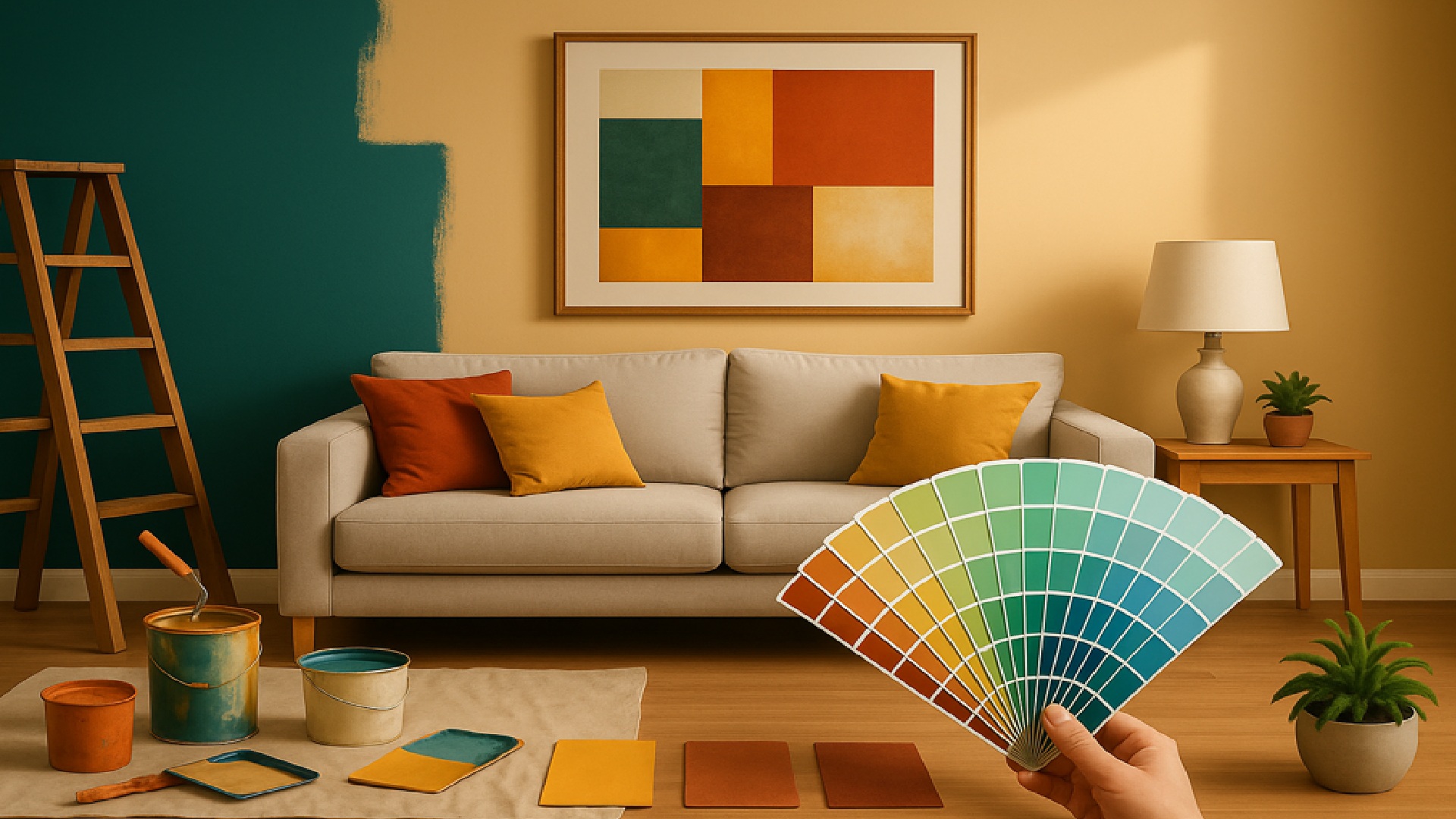
Colors influence how we feel, often on a subconscious level. Warm tones like reds, oranges, and yellows bring energy and vibrancy, while cool tones like blues, greens, and purples foster calm and relaxation. Neutral shades such as white, beige, and gray provide balance, acting as versatile backdrops for other elements of décor.
When decorating, consider the function of each room. A bedroom, meant for rest, benefits from serene shades, while a living room may thrive with warmer or more dynamic colors that encourage social interaction. Kitchens often shine in fresh, invigorating tones that stimulate appetite and energy.
It’s also important to pay attention to personal preference. While color psychology provides useful guidelines, the best choices are always the ones that feel authentic to you and reflect your personality.
Creating Flow Through Your Home
A well-decorated home balances individuality in each room with a sense of continuity. This is achieved by creating a color story that flows from one space to another, ensuring harmony throughout the home. For example, neutral hallways can serve as transitions between bolder-colored rooms, while accent colors can be repeated in subtle details like cushions, rugs, or artwork.
Repetition is key. Using variations of the same hue—such as different tones of blue or green—creates variety without breaking cohesion. The result is a home that feels intentional, where no room looks disconnected from the others.
If you prefer contrast, you can still create flow by maintaining consistency in undertones. A warm beige in the living room can pair well with a warm terracotta in the dining room, for example. The goal is balance, not uniformity.
Choosing Colors by Room Function
Every room serves a purpose, and the colors you choose should reinforce that purpose. Function-driven color selection ensures that each space supports the activities and emotions it is designed for.
Bedrooms benefit from soft hues like light blues, lavenders, and muted greens that encourage rest. Living rooms, on the other hand, can handle bolder colors that promote conversation, such as warm neutrals paired with rich accents. Bathrooms often shine with crisp whites or aquas that evoke freshness and cleanliness.
Kitchens, frequently the heart of the home, often look best with bright, energizing tones like yellows, soft greens, or warm grays.
Dining rooms can benefit from deeper shades like burgundy or navy, which create a sense of intimacy and elegance during meals.
Practical Tips for Selecting Colors
Once you understand the psychology and function of each room, it’s time to get practical about how to choose. Factors like natural light, room size, and existing furniture play a major role in how colors appear.
- Test colors in different lighting by painting small swatches on your wall and observing them throughout the day.
- Balance bold hues with neutrals to prevent the room from feeling overwhelming.
- Take existing elements into account such as flooring, upholstery, and artwork, ensuring the color scheme complements them.
These considerations will help you avoid surprises and ensure your chosen palette feels right in your space.
Using Accent Colors Effectively
Accent colors are one of the easiest ways to add character and variety without overwhelming a room. They can be used in smaller doses—on cushions, rugs, art, or a single feature wall—to highlight your personality while keeping the space balanced.
In neutral spaces, accents provide energy. A beige living room, for example, can be transformed with teal cushions or mustard curtains. In already colorful rooms, accents should be more restrained, perhaps in metallics or muted complementary shades.
The key is moderation. Too many accent colors can dilute the effect, while a few thoughtful touches can tie the whole room together and elevate the design.
Balancing Trends with Timelessness
Trendy colors can be exciting, but they also come with the risk of dating your home quickly. The most successful color schemes combine timeless bases with trendier accents. This way, you can easily refresh the space without committing to a full repaint or renovation.
Neutral walls in whites, grays, or beiges provide longevity, while smaller elements like cushions, throws, or wall art can reflect current trends. This balance ensures your home stays stylish yet adaptable over time.
Another strategy is to incorporate trendy shades in spaces that are easier and less costly to update, such as bathrooms or guest rooms, while keeping main living areas more classic.
Final Thoughts
Choosing the right colors to decorate your home is about more than just aesthetics—it’s about creating spaces that feel good to live in. By considering psychology, functionality, and flow, you can craft a palette that supports your lifestyle while expressing your personal style.
The best homes balance cohesion with individuality, allowing each room to serve its purpose while contributing to a harmonious whole. By layering neutrals with accents, mixing timeless choices with trends, and paying attention to light and space, you ensure every corner of your home feels intentional and inviting.