Color is one of the most powerful tools in interior design. Beyond simply making a room look beautiful, it influences how we feel, behave, and interact with the space.
Understanding color psychology allows you to design environments that don’t just look appealing but also support your lifestyle and emotions. From creating a peaceful bedroom to designing a productive office or a lively dining space, choosing the right shades can transform your home into a place that feels intentional and harmonious.
When used thoughtfully, color has the ability to change the perceived size and atmosphere of a room. Light shades can make small spaces appear larger, while deeper hues can add depth and coziness.
The key is knowing how each color affects mood, then applying it in the right place. By blending personal preference with psychological principles, you can create interiors that feel both stylish and emotionally supportive.
Color psychology has been used in art, branding, and advertising for decades, but its role in home décor is often underestimated. Once you understand how warm, cool, and neutral tones interact with our emotions, you’ll see how easy it is to design rooms that feel balanced, inviting, and uniquely yours.
Understanding Warm Colors and Their Uses
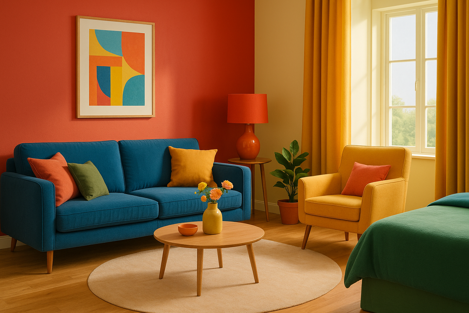
Warm colors such as red, orange, and yellow are naturally stimulating and energizing. They tend to advance visually, making walls feel closer and rooms feel more intimate. Used carefully, these shades create coziness, vibrancy, and enthusiasm in social areas.
Red symbolizes passion and energy. It works beautifully in dining rooms where conversation and appetite are encouraged, but it’s best used as an accent to avoid overwhelming the senses. Orange radiates warmth and enthusiasm, making it perfect for casual living areas or creative corners. Paired with neutrals, it brings cheer without becoming overpowering.
Yellow is linked with happiness and optimism. It brightens spaces with low natural light, such as entryways or kitchens, and instantly creates a welcoming atmosphere. Soft yellows feel gentle and warm, while brighter tones bring energy and liveliness. These warm shades are excellent when you want a room to feel social, inviting, and dynamic.
Embracing Cool Colors for Calm and Balance
Cool colors tend to recede, making a room feel more open and spacious. They are associated with calmness, clarity, and relaxation, which makes them ideal for bedrooms, bathrooms, and other retreat-like spaces.
Blue promotes tranquility and focus. It works in bedrooms to encourage rest, in bathrooms for a spa-like feel, and in offices where concentration is key.
Light blues are soothing, while darker shades add depth and sophistication. Green, inspired by nature, represents renewal and balance. It is versatile and works in nearly every room, bringing freshness to kitchens, balance to living rooms, and serenity to bedrooms.
Purple combines the stability of blue with the energy of red, making it unique. Deep purples suggest luxury and drama, while lighter shades like lavender are romantic and calming. These tones shine in creative spaces, cozy reading nooks, or elegant bedrooms. Cool shades overall provide a sense of peace and harmony that balances the intensity of warmer colors.
The Role of Neutrals in Room Design
Neutrals serve as the foundation of most interiors. They provide balance, flexibility, and a timeless quality that allows accent colors to shine. Without them, bright or bold shades can feel chaotic or overwhelming.
White creates an airy, clean backdrop that enhances light and makes spaces look larger. Gray is modern, versatile, and pairs well with both cool and warm tones.
Beige feels warm and inviting, ideal for creating a cozy, comfortable space. Finally, black, when used sparingly, adds depth and grounding contrast, giving definition to lighter palettes.
The beauty of neutrals lies in their adaptability. You can refresh a space seasonally or as your style evolves simply by changing accent pieces like pillows, rugs, or artwork while keeping the base neutral. This makes them both stylish and practical.
- White: Clean, spacious, versatile
- Gray: Modern, sophisticated, flexible
- Beige: Warm, welcoming, timeless
- Black: Bold, grounding, dramatic
Choosing the Right Color for Each Room
Each room in your home serves a different purpose, and its color should reflect that. A living room benefits from warm neutrals or soft greens to encourage comfort and conversation, while an accent wall in deep blue or terracotta can add personality. Bedrooms are best with calming cool tones such as blue, lavender, or soft green to encourage rest.
In kitchens and dining areas, warm shades like yellow and orange stimulate appetite and interaction. To avoid overstimulation, balance them with neutral cabinetry or countertops.
For home offices, blue promotes focus, green adds freshness, and a touch of yellow encourages creativity. Bathrooms benefit from spa-like combinations of white, blue, and green, while warm neutrals make them feel cozy and inviting.
By aligning colors with function, you design spaces that work with your daily life rather than against it.
Combining Colors Effectively
Color psychology is most effective when shades are combined thoughtfully. Balance and proportion are crucial, ensuring no single color dominates to the point of discomfort. One helpful method is the 60-30-10 rule, where 60% of the room uses a dominant color, 30% a secondary shade, and 10% an accent.
Pairing warm and cool tones keeps spaces from feeling too extreme. For example, a cool gray base with warm wood accents strikes the perfect balance. Adding patterns and textures helps bring dimension to monochromatic schemes, preventing them from looking flat.
When chosen with intention, color combinations create harmony, depth, and flow throughout the home.
- 60-30-10 Rule: Dominant, secondary, accent
- Balance warm + cool tones
- Patterns and textures to add depth
- Consistency across rooms for flow
Using Accent Colors to Enhance Mood
Accent colors are a subtle yet powerful way to shift the mood of a room. They can be incorporated through furniture, textiles, wall art, or even decorative accessories like vases and candles. A bold accent like red, teal, or mustard adds vibrancy to a neutral room. Metallic tones such as gold, silver, or bronze introduce elegance and luxury.
Natural accents also work beautifully. Green plants, wooden furniture, or stone pieces bring warmth and grounding energy into any space. The beauty of accents lies in their flexibility—you can swap them seasonally or whenever you crave a fresh look without committing to a complete redesign.
The Influence of Light on Color Perception
Lighting dramatically affects how colors appear. Natural light reveals the truest shades, but even that varies depending on the room’s orientation. North-facing rooms may make colors appear cooler, while south-facing rooms enhance warmth.
Artificial lighting also changes perception. Warm bulbs highlight reds, oranges, and yellows, while cool lighting emphasizes blues and greens. Dimmable options allow flexibility, shifting a room from lively to relaxed with ease. Always test paint swatches at different times of the day before committing.
- Natural light shows true colors
- Warm bulbs highlight warm tones
- Cool bulbs emphasize blues and greens
- Dimmable options adjust atmosphere
Final Thoughts
Using color psychology in decorating is about more than trends—it’s about creating a home that supports how you want to live and feel. Warm shades bring energy and connection, cool tones encourage calm and focus, and neutrals provide timeless balance. Accent colors, thoughtful combinations, and lighting all play essential roles in shaping the final effect.
By understanding the emotional impact of color, you can make choices that align with your personality and lifestyle. Whether you’re aiming for serenity in the bedroom, productivity in the office, or vibrancy in the living room, your color palette has the power to turn your home into a place that feels exactly right.