Monochromatic décor has a timeless charm. It feels clean, cohesive, and elegant, creating a sense of harmony that many other styles struggle to achieve. The challenge, however, is making sure the design doesn’t appear flat or uninspired.
When everything falls into a single color palette, the key to success lies in tones, textures, and small accents that bring life to the space.
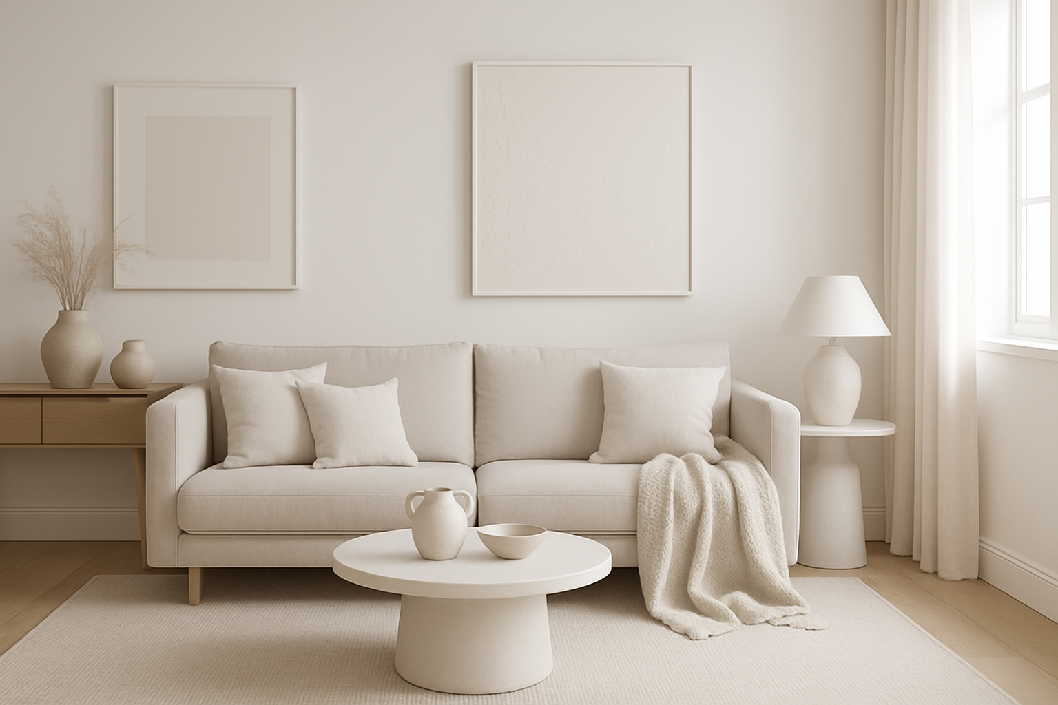
Whether you imagine a serene all-white living room, a sophisticated gray bedroom, or a dramatic deep-blue kitchen, a monochromatic approach can feel stylish and refreshing. Done thoughtfully, it’s never boring—it’s subtle design with big impact.
Understanding Monochromatic Design
A monochromatic scheme uses one base color and plays with its lighter and darker variations. For instance, a gray palette could move from pale dove-gray walls to charcoal furniture and slate accessories. The idea isn’t sameness—it’s controlled variety within a single family of shades.
This approach works beautifully for spaces that need calm and order. It’s also great for smaller rooms, where sticking to one palette creates the illusion of more space.
The challenge is balance: without variation, the look risks becoming plain. That’s why contrast, texture, and light are essential.
Choosing the Base Color
Your base color sets the mood, so pick it with care. A white palette feels fresh and versatile, a gray scheme suggests sophistication, while blue can be soothing or bold depending on the tone. Beige and taupe bring warmth, while black is striking and dramatic if used carefully.
Consider your natural light as well. Darker colors thrive in bright spaces, while paler tones can open up dimly lit rooms. The choice should not only fit your taste but also suit the room’s purpose and conditions.
Layering Tones for Depth
One of the easiest ways to avoid monotony is by layering tones. Think of it as building levels: light shades on large surfaces, medium tones on furniture, and darker shades in accents. This creates depth without adding new colors.
For example, in a blue living room, pale walls, navy upholstery, and indigo cushions create natural variation. The eye moves across the room, noticing details without leaving the palette. It feels harmonious yet dynamic.
Playing with Texture
Texture is where monochromatic design truly comes alive. A single shade can look very different depending on whether it’s matte, glossy, rough, or smooth. By combining textures, you add richness and prevent flatness.
Mix linen with velvet, pair wood with stone, or use glass alongside metal. Even in an all-white scheme, the difference between a fluffy rug, painted walls, and glossy ceramics makes the space visually engaging.
Adding Patterns with Subtlety
Patterns also help keep the look interesting, but they should be gentle. Tone-on-tone wallpaper, striped cushions, or geometric rugs in the same palette add movement without introducing new colors.
The key is moderation. A single bold patterned element can energize the room, but too many will disturb the calm balance. Think of patterns as highlights, not the main act.
Using Contrast Within the Color
Even a single-color palette offers contrast. The trick is to find it within the shade family. Matte and glossy surfaces, sheer and heavy fabrics, warm and cool undertones—all create variation without breaking the monochrome theme.
This contrast keeps the eye curious. It ensures the room doesn’t feel like one continuous block of color but instead a collection of layered details.
Accent Pieces That Work
Strict monochrome avoids outside colors, but a few neutral accents can make the scheme feel more personal. Options include metallics like gold or silver, natural woods, or greenery from plants. These touches don’t disrupt the palette but add warmth and dimension.
- Metallic details bring a hint of glamour.
- Plants soften edges and add freshness.
- Wood tones provide grounding warmth.
Used sparingly, these accents enhance the space rather than dominate it.
The Role of Lighting
Lighting can transform a monochromatic interior. Warm lighting softens darker palettes, while cool lighting sharpens modern schemes. Layering is crucial: combine overhead fixtures with lamps, sconces, and candles to create depth.
Spotlights can highlight textured walls or architectural features, ensuring that your carefully chosen details are noticed. With the right lighting, even the simplest palette feels luxurious.
Monochromatic Design by Room
In living rooms, keep things comfortable with layered seating, textured throws, and tonal rugs. Bedrooms benefit from soothing shades and soft lighting, while kitchens can shine with sleek cabinetry and contrasting surfaces like tiles or counters. Bathrooms often look spa-like in monochromatic schemes, especially when combined with stone or wood accents.
Every room can carry the style, but the execution should reflect its purpose—cozy for bedrooms, energizing for kitchens, calm for bathrooms.
Mistakes to Avoid
Some common pitfalls include:
- Using only one shade instead of layering tones
- Forgetting texture, leading to flatness
- Overloading with busy patterns
- Ignoring lighting, which can dull your chosen color
By avoiding these mistakes, you allow the monochromatic design to show its full potential.
Making It Personal
Even in a disciplined palette, your personality should shine. Art in complementary shades, custom finishes, or meaningful objects in muted tones keep the room unique. Think of monochrome as the canvas, and your style as the finishing touch.
Final Thoughts
Monochromatic décor is far from boring when done with care. It’s elegant, versatile, and deeply calming, offering harmony without sacrificing character. With layered tones, rich textures, subtle patterns, and thoughtful lighting, your space can feel both unified and alive.
The beauty of this style lies in its simplicity—it proves that sometimes, sticking to one color is all you need for a home that feels sophisticated, timeless, and full of depth.