Pastel tones are often associated with serenity, lightness, and warmth, making them a timeless choice for creating inviting interiors. Far from being limited to nurseries or overly feminine designs, these soft shades have evolved into versatile tools for modern decorators.
They can suit a wide range of styles—from Scandinavian minimalism to rustic chic and even sleek contemporary spaces.
What makes pastels so appealing is their ability to set a calming mood while still feeling fresh and stylish. Unlike bold colors that demand attention, pastels act as gentle backdrops that highlight textures, furnishings, and architectural features.
They are particularly effective in rooms where comfort and relaxation are the priority. When combined thoughtfully with lighting, textures, and complementary hues, pastels can transform any space into a cozy retreat.
Whether you want to refresh an entire room or introduce subtle accents, pastel tones offer flexibility and elegance. The key lies in understanding how to select and pair them, as well as how to balance them with neutrals and textures.
Why Pastels Work for Cozy Interiors
One of the strongest reasons pastels create cozy environments is their psychological impact. Soft shades tend to recede visually, creating an atmosphere of openness and calm. They don’t overwhelm the eye, which makes a room feel more spacious and breathable while still being warm.
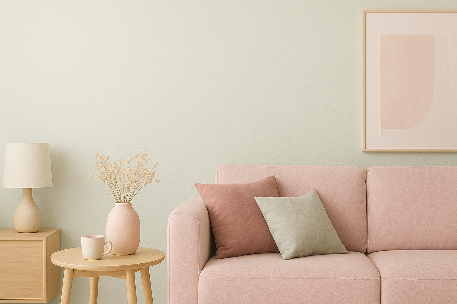
These tones are also extremely adaptable. For instance, blush pink can bring softness to a contemporary living room, mint green adds freshness to a rustic kitchen, and pale blue lends serenity to minimalist interiors. Their versatility makes them suitable for nearly any type of home.
Another advantage is their ability to act as a bridge between different styles. A pastel wall can soften industrial décor, or a pastel sofa can brighten a traditional space without clashing. This adaptability ensures pastels remain timeless while also feeling current.
Choosing the Right Pastel Colors
Each pastel tone conveys a different mood, so choosing wisely is essential. Soft blues and lavenders are ideal for bedrooms or reading corners, as they evoke serenity and quiet.
Blush pink and peach add warmth and are perfect for living areas where you want to encourage relaxation and connection. Mint green and pale aqua bring freshness to kitchens and bathrooms, while buttercream yellow energizes spaces lacking natural light.
It’s also important to consider how natural and artificial light affect these shades. Pastels often look brighter in daylight and more subdued under soft evening light. Testing samples on your walls at different times of day can help ensure you select the most flattering tone.
By paying attention to these nuances, you’ll be able to use pastels strategically to create a specific atmosphere in each room of your home.
Balancing Pastels with Neutrals
A common challenge with pastels is avoiding an overly sweet or childish look. The solution lies in pairing them with neutral shades such as white, beige, light gray, or natural wood tones. These neutral anchors give structure and sophistication, allowing pastels to shine without dominating.
For example, pastel blue walls combined with crisp white trim and pale wood furniture strike the perfect balance between softness and elegance. Similarly, blush cushions on a neutral beige sofa can add personality without overwhelming the space.
Using neutrals also makes it easier to refresh your décor seasonally. You can swap out pastel accessories for deeper hues in colder months while maintaining the same foundational palette. This flexibility ensures that your interior always feels cohesive and fresh.
Adding Depth Through Textures
When using pastels, texture plays a vital role in avoiding flatness. If all surfaces are smooth and light in tone, a room may feel one-dimensional. Instead, layering materials and finishes brings depth and coziness.
Consider combining a peach-toned sofa with a chunky knit throw, pairing a linen rug with velvet cushions, or mixing rattan side tables with smooth ceramic vases. These juxtapositions create tactile richness that elevates the softness of pastels into something more sophisticated.
- Textured fabrics prevent pastel rooms from feeling bland
- Natural elements like rattan or wood add warmth
- Shiny or metallic finishes provide contrast and modernity
By thoughtfully layering these elements, pastels become the backdrop for an environment full of character and comfort.
Using Pastels in Different Rooms
Pastels can be applied throughout the home, each space benefiting from a tailored approach. In the living room, sage walls with blush accents and light wood furniture can create a welcoming social space. For bedrooms, lavender or powder blue walls paired with crisp white bedding evoke calm and relaxation.
Kitchens can benefit from powder-blue cabinets or mint appliances, adding charm while maintaining freshness. Even bathrooms can shine with aqua or peach tiles, combined with white grout and sleek chrome fixtures for a spa-like feel.
What ties all these rooms together is consistency. Limiting the palette to two main pastel tones and supporting them with neutrals creates harmony while allowing flexibility in accents.
Enhancing with Lighting and Accessories
Lighting dramatically influences how pastels appear. Natural daylight makes them look brighter and more vibrant, while warm LED lighting ensures they remain cozy after dark.
Lamps and pendants in pastel or complementary shades can further enhance the palette while also serving as decorative pieces.
Accessories are another way to bring pastels into a space without commitment. Cushions, curtains, vases, and even framed art can introduce soft tones in small but impactful ways. For those hesitant to paint walls, accessories provide a flexible entry point.
The beauty of accessories is their versatility—you can update them seasonally, combining pastels with floral motifs in spring or pairing them with deeper tones and heavier fabrics in autumn and winter.
Creating Comfort Through Subtle Sophistication
The charm of pastel interiors lies in their ability to feel both comforting and refined. By carefully selecting colors, balancing them with neutrals, and layering textures, you create spaces that are warm, stylish, and personal.
Pastels also pair beautifully with natural greenery, metallic accents, and simple artwork, ensuring the room feels curated rather than overly styled.
Ultimately, pastels are not just about softness—they are about balance. When used thoughtfully, they create interiors that feel timeless and welcoming, where every element contributes to an atmosphere of comfort.
With the right approach, pastels can make your home a place where elegance and coziness coexist effortlessly.